Case Study · 02 · B2B Product
Rieder. Sample order, redesigned.
Reducing friction in the material sample order flow for a premium B2B facade manufacturer, turning a broken conversion point into a fast, architect-first experience.
The process
Seven steps from problem to shippable flow.
From a single broken page to a redesigned, localised, dev-handed-off experience, here's how the work moved.
Physical samples are non-negotiable, and ordering one was painful.
For architects specifying facade materials, a physical sample is a required step before any procurement decision. Texture, colour, shadow, and material weight cannot be judged on a screen.
Rieder's sample order flow was the most critical conversion point on the site, and one of the most broken. It required 8 steps, started only from a specific product page, and forced a login before users could do anything.
High-intent B2B buyers were hitting unnecessary barriers at the exact moment they were ready to commit.
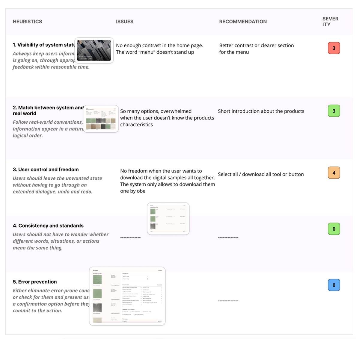
Competitive analysis, heuristics, and contextual inquiry.
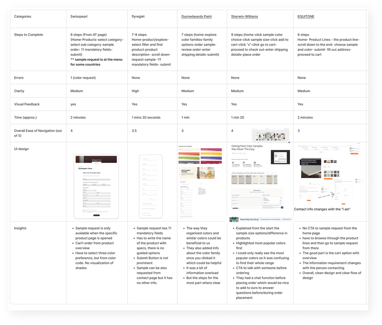
We ran a competitive task analysis across 11 manufacturer websites, measuring steps, errors, time, and ease of completing a sample request.
We layered in heuristic evaluations and a contextual inquiry with architects using the flow on an iPad, their real device, to observe friction points live.
- Reduce the number of steps to complete a request
- Add clear progress indicators throughout the flow
- Introduce a persistent cart so selections never disappear
- Simplify filtering with familiar terminology
- Remove the login barrier entirely for browsing
Four specific problems were killing the flow.
After all the research, four key problems came into focus.
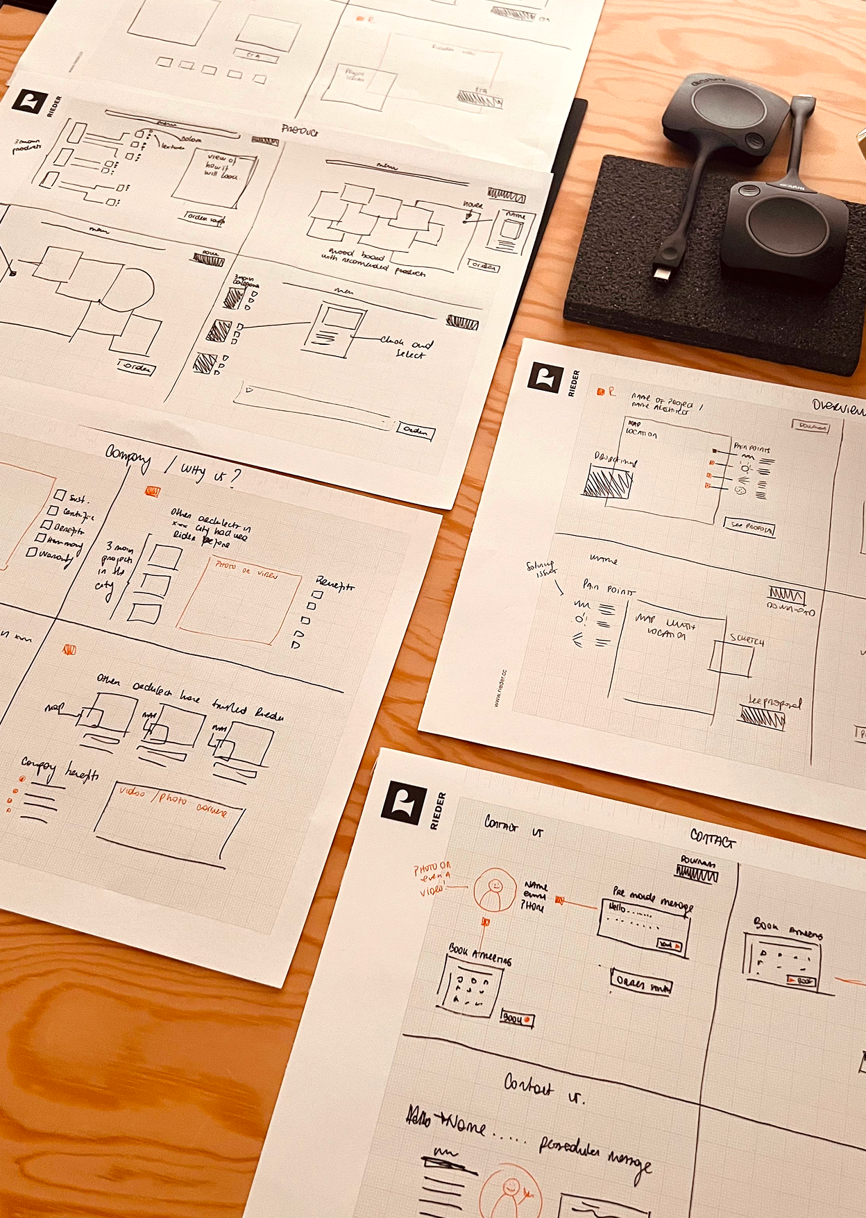
Translating findings straight into structure.
With the four core problems defined, wireframes restructured the flow from the ground up.
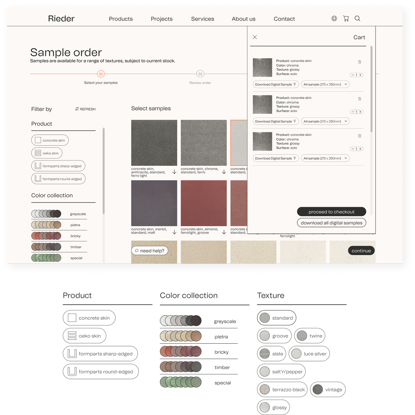
The entry point moved to the global navigation. The login gate was removed entirely for browsing. A persistent slide-in cart let users add samples without ever losing their place.
The 8-step flow compressed into 3 clear stages: select samples → review order → shipping, with a visible progress indicator at every stage.
Filters were simplified and relabelled using language architects already used in their daily workflow.
Every wireframe decision traced back to a specific research finding. The structure came from the data, not from assumptions about what looked clean.
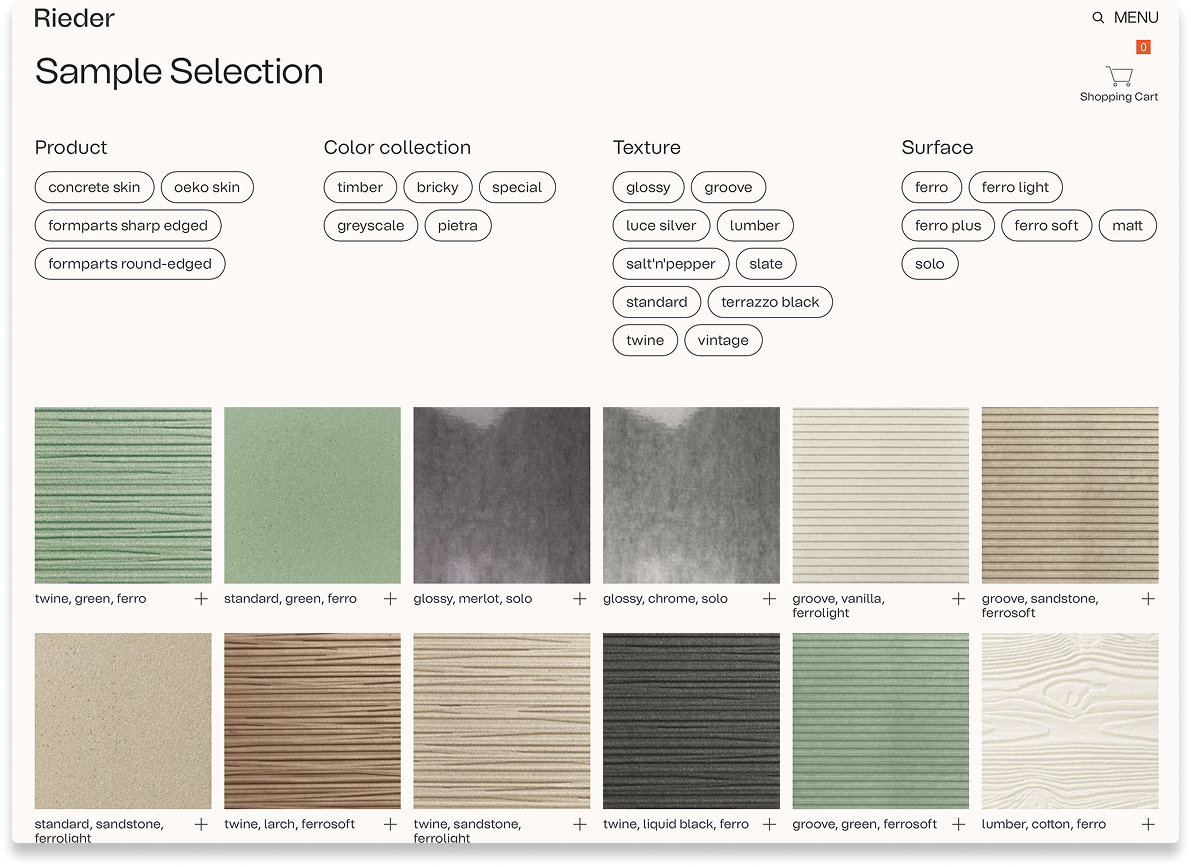
Three steps, no login, designed for a global professional audience.
The redesigned flow, Select samples → Review order → Shipping. The login barrier was gone, a persistent slide-in cart was in, and every label spoke architect.
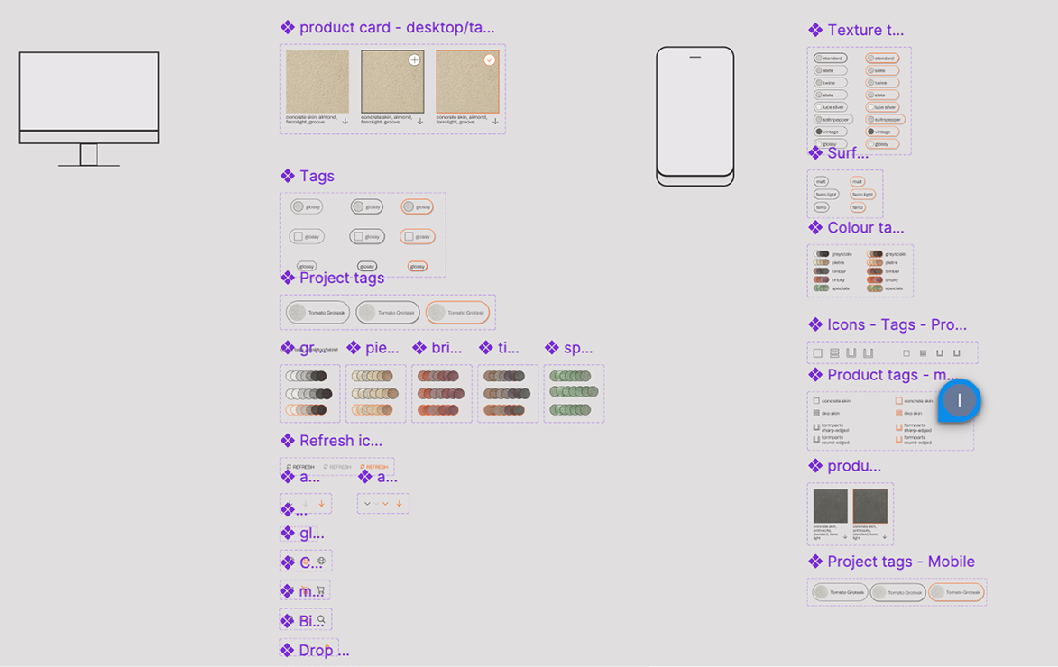
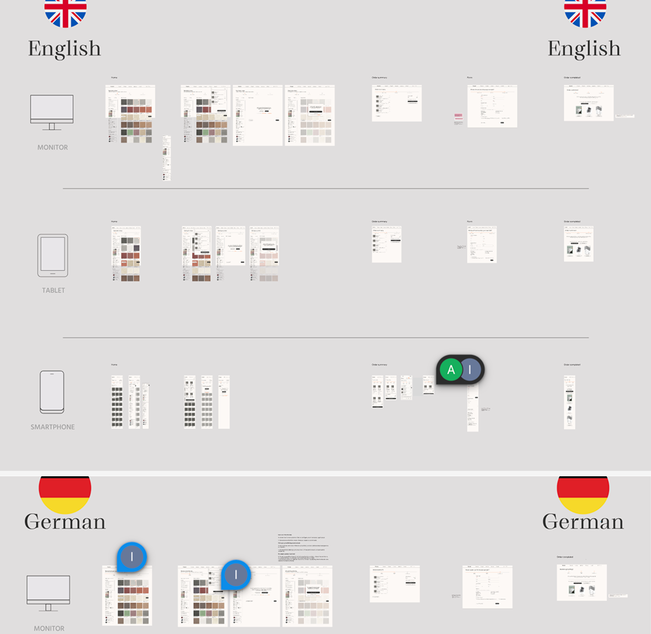
Breakpoints covered desktop, tablet, and mobile, with tablet prioritised given how architects actually work on site.
Localisation was built in from day one. All labels, filters, error states, and shipping fields were mapped for translation across multiple languages and regional variants.
Every label, breakpoint, and localisation choice ties back to a specific research finding or a known product constraint.
From Figma to Framer, built with the dev team.
Once designs were approved, we moved into Framer for implementation in close collaboration with the development team, translating components, states, and edge cases into a working build.
Working in the real environment surfaced issues a static prototype never would: scroll behaviour on tablet, hover loss on touch, cart persistence across reloads.
Issues found in Framer are cheaper to fix than post-launch. Working in the real environment, not just a prototype, made that possible.
Research into recommendations stakeholders could ship.
We delivered severity-rated heuristic findings, contextual-inquiry observations, a competitive benchmark, and a prioritised recommendation list, each tied to an observed behaviour.
Final designs covered the full sample order flow from selection to confirmation, across all breakpoints and both core languages. Working in a product team meant every decision was stress-tested across disciplines before it was finalised.
A lesson in working closely with developers, understanding their constraints, communicating design intent clearly, and being willing to adapt when implementation revealed something the prototype hadn't.
Next case study