Case Study · 01 · Android App
Zaus. Haptic-first wellness.
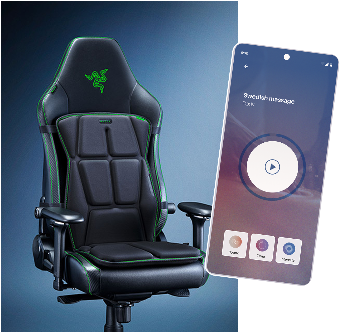
An Android app that bridges Razer's haptic gaming chair with the user. Haptic-first UX, low cognitive load, and a brand identity that steps beyond the gaming aesthetic, designed solo during a three-month internship in Berlin.
The process
From a brief on relaxation, to a shippable system.
Six phases, three months, one Figma file ready for development handoff.
The problem was invisible, until you used the chair.
Razer's haptic gaming chair had no dedicated wellness app. Users who wanted to relax, focus, or meditate while seated had no simple way to launch programs, control vibration intensity per pad, or personalise the experience from their phone.
The brief: design an Android app that works as a bridge between the chair and the user. Haptic-first, low cognitive load, and with its own brand identity beyond Razer's gaming aesthetic.
Four competitors, one key insight.
I audited Calm, Headspace, Meditopia, and Nike Training Club, analysing information architecture, navigation patterns, and onboarding flows.
The insight: the best apps don't make you think. Headspace's "Today" tab and Meditopia's mood-tagging system both removed friction from the first interaction. I defined design hypotheses early. Rather than running interviews, we prototyped first and tested immediately.
Borrow clarity and personalisation from the best. Keep discovery intentional and mood-driven.
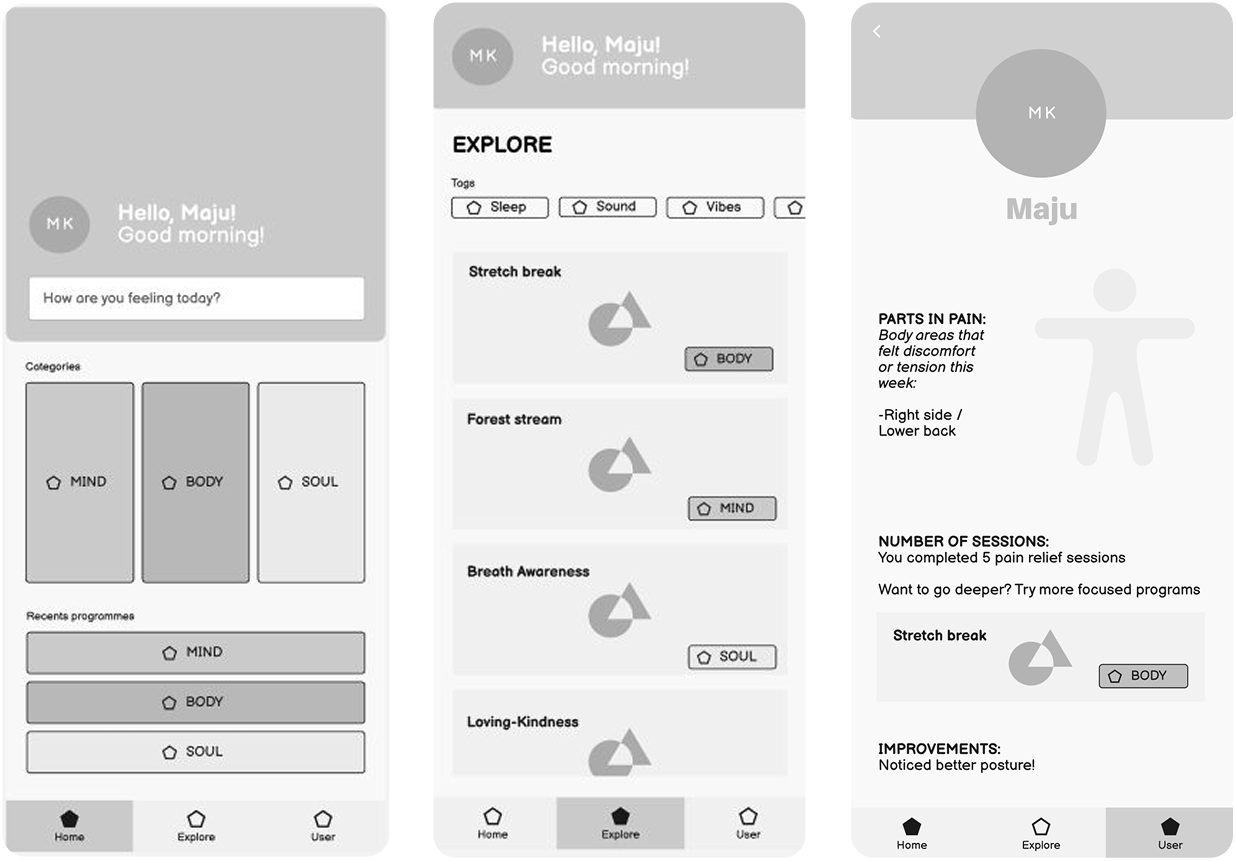
Structure before pixels, mapping the full user flow.
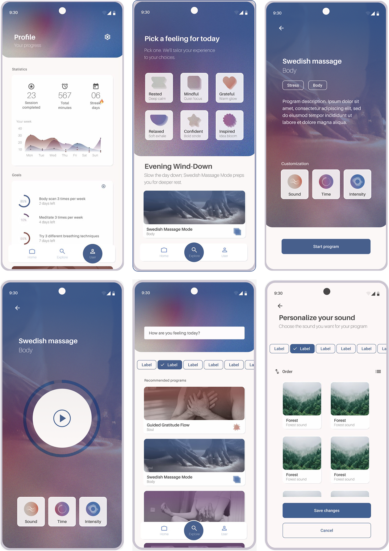
I mapped the app into three core sections: Home (mood prompt + Mind/Body/Soul categories + recent programs), Explore (tag and mood-based discovery), and Profile (usage data, goals, settings). This became the skeleton every design decision was built on.
I also established design hypotheses: users will use the app at their desk or in bed, not just gaming. Customisation matters, but sensible defaults matter more. Tags belong in Explore, not cluttering Home.
Before any visual design began, every screen decision traced back to this map.
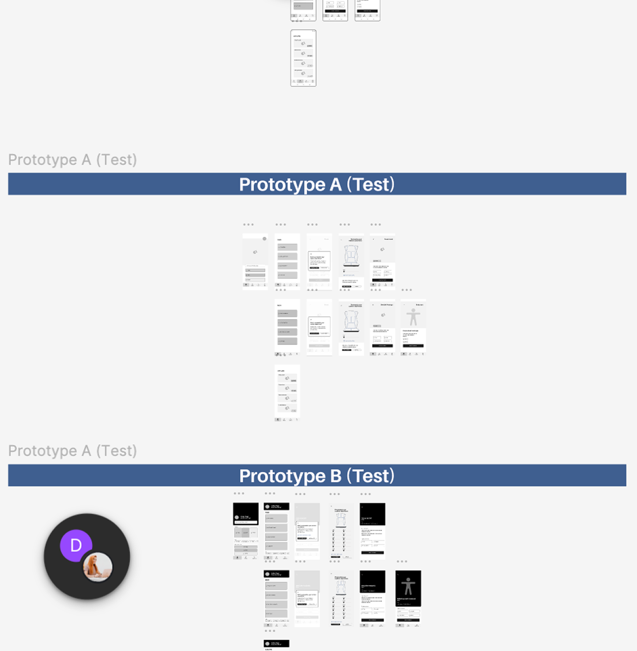
Two prototypes, six users, and a lesson in mobile interactions.
I built two distinct wireframe versions to test menu architecture and layout preferences, then ran usability testing with six users.
The most important catch: the pad-intensity screen used hover states, which don't exist on mobile (aha!). A basic but real mistake, caught before any high-fidelity work began.
After testing, I merged the two versions, removed the disruptive pre-program pop-up, moved tags from Home to Explore, and redesigned the pad controls as a drag-based interaction with colour fill to show intensity.
In usability testing, what matters is the quality of the task and the neutrality of how you present it. Not the distance between you and the tester.
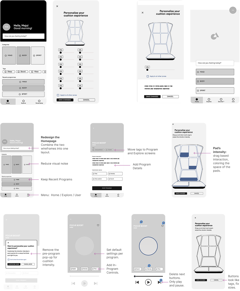
High fidelity, from the hardest screen first.
I started with the Profile screen deliberately. The most complex screen in the app, with the most data to organise. Solving it first defined the visual language, typography system, and component library for everything else.
I tested gradient cards, full-colour and monochrome icon sets, six homepage layouts, and multiple card styles before landing on a system: white card backgrounds, category-coloured gradient image overlays, abstract layered icons (not faces, those felt too close to Headspace), and neutral dark-gray text for readability.
The Explore screen went through the biggest pivot: from program-led to mood-first. Instead of a list, users now open to "Pick a feeling for today", a 3×2 grid of custom abstract icons (Rested, Mindful, Grateful, Relaxed, Confident, Inspired) mapped to program recommendations and time-of-day context.
The biggest pivot wasn't about pixels. It was the question: what do users open the app to do?
A 45-minute presentation, and handoff-ready Figma.
I presented the full design process to the Ohmnum team: problem, research, flow, iterations, and final prototype. The presentation was 45 minutes, practised ten times, built to explain the why behind every decision, not just what was built.
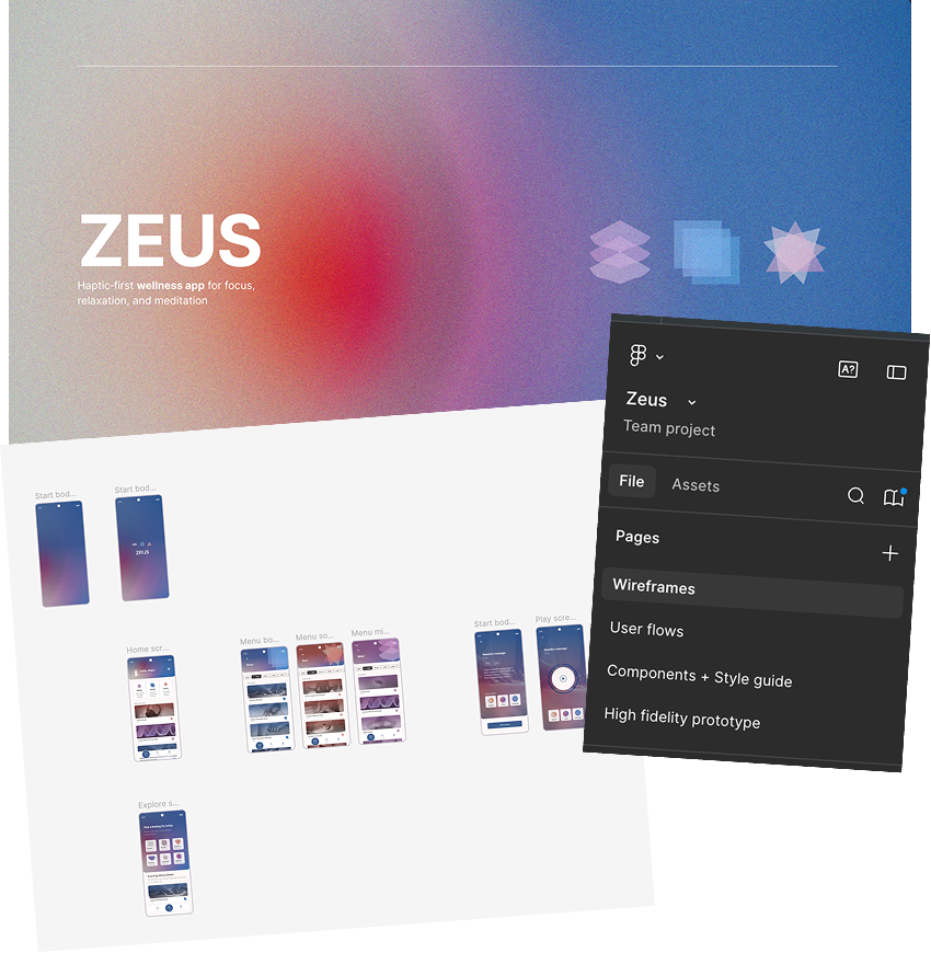
Post-presentation, I organised all Figma files with clear page structure, renamed every layer, and separated wireframes, components, style guide, and high-fidelity screens for developer handoff.
Professional presentations focus on intent and outcomes, not process steps. The shift from academic to industry thinking was one of the hardest parts of this internship.
Next case study